CSS Box Model
Understanding the Building Blocks of Web Layout
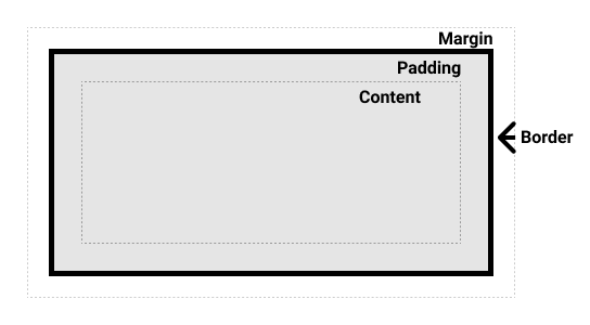
The CSS Box Model is a key concept that outlines how elements are displayed on a web page, representing each element as a rectangular box made up of content, padding, border, and margin. This article will discuss the box model components, offer practical examples, and show how to use it for responsive and attractive web layouts.
Introduction
The CSS Box Model is a fundamental concept in CSS that defines how elements are displayed on a web page. It represents an element as a rectangular box composed of several components: content, padding, border, and margin.
Do You Know?
The CSS Box Model is not a physical box, but rather a conceptual model that helps us understand how elements are sized and positioned on a page.
Width
The width property defines the width of the content area inside the element's box. It does not include padding, border, or margin.
.element {
  width: 200px;
}
Height
The height property defines the height of the content area inside the element's box. It does not include padding, border, or margin.
.element {
  height: 100px;
}
Padding
The padding property defines the space between the content and the border of an element. It adds space around the content, creating visual separation between the content and the element's edge.
.element {
  padding: 20px;
}
Border
The border property defines the border of an element. It can be used to create visual separation between elements or to add decorative elements.
.element {
  border: 2px solid black;
}
Margin
The margin property defines the space between the element's border and other elements. It controls the spacing between elements and is used to create visual separation between them.
.element {
  margin: 10px;
}
Box Sizing
The box-sizing property controls how the total width and height of an element are calculated. By default, the width and height of an element only include the content area, and the padding and border are added on top of it. Using box-sizing: border-box;, the total width and height of an element will include the padding and border, making the calculation more predictable.
.element {
  box-sizing: border-box;
}
Important Note
Understanding the box model is crucial for creating effective and predictable layouts. It allows you to control the size and spacing of elements accurately
Basic Responsive Layout
Responsive web design focuses on creating websites that adapt to different screen sizes and devices. The box model plays a key role in achieving responsive layouts by providing a flexible and predictable structure.
Using media queries, you can apply different CSS styles based on the screen size. For example, you could set a fixed width for an element on larger screens and then use percentages for a more flexible layout on smaller screens.
@media (min-width: 768px) {
  .element {
    width: 50%;
  }
}

@media (max-width: 767px) {
  .element {
    width: 100%;
  }
}
Calculation Examples
Let's consider an example with an element that has a width of 100px, padding of 10px, border of 5px, and a margin of 15px. If you want to calculate the total width occupied by this element, you need to consider all the components of the box model.
If the box-sizing property is set to content-box (the default value), the total width would be calculated as follows:
Total Width = width + 2 * padding + 2 * border + 2 * margin
Total Width = 100px + 2 * 10px + 2 * 5px + 2 * 15px
Total Width = 170px
However, if the box-sizing property is set to border-box, the total width would be calculated as follows:
Total Width = width
Total Width = 100px
This is because with border-box, the total width already includes padding and border, so the margin is added on top of it.
Avoid This
Overusing margins can lead to excessive spacing and poor visual hierarchy. Use margins strategically to create a balanced and visually appealing layout.
Summary
- The CSS Box Model is a fundamental concept in CSS that defines how elements are displayed on a web page.
- It represents an element as a rectangular box composed of content, padding, border, and margin.
- Understanding the box model is crucial for creating effective and predictable layouts.
- Using media queries and the box model, you can achieve responsive layouts that adapt to different screen sizes and devices.